ScrollProgress
Thin reading-progress bar that fills as the page — or a target element — scrolls, driven by a zero-JS CSS scroll-timeline where supported and a throttled scroll listener everywhere else, with an optional accessible progressbar label
Available for Svelte 5, React, and Vue 3.
Preview
<script lang="ts">
	import { ScrollProgress } from "fancy-ui-svelte";

	let box = $state<HTMLElement | null>(null);
</script>

<div class="mx-auto flex w-full max-w-sm flex-col gap-2 p-6">
	<ScrollProgress target={box} position="inline" class="text-primary rounded-full" />
	<div
		bind:this={box}
		class="border-border bg-card h-56 overflow-y-auto rounded-lg border p-4 text-sm leading-relaxed"
	>
		<p class="text-foreground text-xs font-semibold tracking-wide uppercase">0.9.0</p>
		<p class="text-muted-foreground mt-1 mb-4">
			Redesigned the sidebar navigation and shipped a set of layout primitives for scroll-driven
			pages.
		</p>
		<p class="text-foreground text-xs font-semibold tracking-wide uppercase">0.8.0</p>
		<p class="text-muted-foreground mt-1 mb-4">
			Added dark-mode tokens to every core component and fixed a focus-trap bug in the command menu.
		</p>
		<p class="text-foreground text-xs font-semibold tracking-wide uppercase">0.7.0</p>
		<p class="text-muted-foreground mt-1 mb-4">
			Introduced the shared motion foundation: easing tokens, a reduced-motion rune, and staggered
			reveal presets.
		</p>
		<p class="text-foreground text-xs font-semibold tracking-wide uppercase">0.6.0</p>
		<p class="text-muted-foreground mt-1">
			Rebuilt the docs search and added keyboard shortcuts for jumping between components.
		</p>
	</div>
	<p class="text-muted-foreground text-xs">
		Scroll the panel above — the bar tracks that element directly (<code class="text-xs"
			>target</code
		>), not the whole page.
	</p>
</div>
Installation
Usage
<script lang="ts">
	import { ScrollProgress } from "fancy-ui-svelte";

	let box = $state<HTMLElement | null>(null);
</script>

<div class="mx-auto flex w-full max-w-sm flex-col gap-2 p-6">
	<ScrollProgress target={box} position="inline" class="text-primary rounded-full" />
	<div
		bind:this={box}
		class="border-border bg-card h-56 overflow-y-auto rounded-lg border p-4 text-sm leading-relaxed"
	>
		<p class="text-foreground text-xs font-semibold tracking-wide uppercase">0.9.0</p>
		<p class="text-muted-foreground mt-1 mb-4">
			Redesigned the sidebar navigation and shipped a set of layout primitives for scroll-driven
			pages.
		</p>
		<p class="text-foreground text-xs font-semibold tracking-wide uppercase">0.8.0</p>
		<p class="text-muted-foreground mt-1 mb-4">
			Added dark-mode tokens to every core component and fixed a focus-trap bug in the command menu.
		</p>
		<p class="text-foreground text-xs font-semibold tracking-wide uppercase">0.7.0</p>
		<p class="text-muted-foreground mt-1 mb-4">
			Introduced the shared motion foundation: easing tokens, a reduced-motion rune, and staggered
			reveal presets.
		</p>
		<p class="text-foreground text-xs font-semibold tracking-wide uppercase">0.6.0</p>
		<p class="text-muted-foreground mt-1">
			Rebuilt the docs search and added keyboard shortcuts for jumping between components.
		</p>
	</div>
	<p class="text-muted-foreground text-xs">
		Scroll the panel above — the bar tracks that element directly (<code class="text-xs"
			>target</code
		>), not the whole page.
	</p>
</div>
Examples
Basic Usage
<script lang="ts">
	import { ScrollProgress } from "$lib/fancy-ui/scroll-progress";

	let box = $state<HTMLElement | null>(null);
</script>

<div class="mx-auto flex w-full max-w-sm flex-col gap-2 p-6">
	<ScrollProgress target={box} position="inline" class="text-primary rounded-full" />
	<div
		bind:this={box}
		class="border-border bg-card h-56 overflow-y-auto rounded-lg border p-4 text-sm leading-relaxed"
	>
		<p class="text-foreground text-xs font-semibold tracking-wide uppercase">0.9.0</p>
		<p class="text-muted-foreground mt-1 mb-4">
			Redesigned the sidebar navigation and shipped a set of layout primitives for scroll-driven
			pages.
		</p>
		<p class="text-foreground text-xs font-semibold tracking-wide uppercase">0.8.0</p>
		<p class="text-muted-foreground mt-1 mb-4">
			Added dark-mode tokens to every core component and fixed a focus-trap bug in the command menu.
		</p>
		<p class="text-foreground text-xs font-semibold tracking-wide uppercase">0.7.0</p>
		<p class="text-muted-foreground mt-1 mb-4">
			Introduced the shared motion foundation: easing tokens, a reduced-motion rune, and staggered
			reveal presets.
		</p>
		<p class="text-foreground text-xs font-semibold tracking-wide uppercase">0.6.0</p>
		<p class="text-muted-foreground mt-1">
			Rebuilt the docs search and added keyboard shortcuts for jumping between components.
		</p>
	</div>
	<p class="text-muted-foreground text-xs">
		Scroll the panel above — the bar tracks that element directly (<code class="text-xs"
			>target</code
		>), not the whole page.
	</p>
</div>
Labelled
Accessible role="progressbar" with a live percentage readout.
<script lang="ts">
	import { ScrollProgress } from "$lib/fancy-ui/scroll-progress";

	let box = $state<HTMLElement | null>(null);
	let percent = $state(0);

	function onScroll() {
		if (!box) return;
		const max = box.scrollHeight - box.clientHeight;
		percent = max > 0 ? Math.round((box.scrollTop / max) * 100) : 0;
	}
</script>

<div class="mx-auto flex w-full max-w-sm flex-col gap-2 p-6">
	<div class="flex items-center justify-between">
		<span class="text-muted-foreground text-xs font-medium">Reading progress</span>
		<span class="text-muted-foreground text-xs tabular-nums">{percent}%</span>
	</div>
	<ScrollProgress
		target={box}
		position="inline"
		label="Reading progress"
		class="text-primary rounded-full"
	/>
	<div
		bind:this={box}
		onscroll={onScroll}
		class="border-border bg-card h-56 overflow-y-auto rounded-lg border p-4 text-sm leading-relaxed"
	>
		<p class="text-muted-foreground mb-3">
			A progress indicator only earns its place when it tells a reader something scroll position
			alone doesn't: how much is left, not just how far they've come.
		</p>
		<p class="text-muted-foreground mb-3">
			For a short note that fits one screen, it's noise. For a long guide, a changelog, or a policy
			document, it turns "how much further?" from a guess into a glance.
		</p>
		<p class="text-muted-foreground mb-3">
			The same number that fills the bar is available to assistive technology too — set a
			<code class="text-xs">label</code> and the bar announces itself as a real progress control, not
			just decoration.
		</p>
		<p class="text-muted-foreground">Keep scrolling to watch both readouts move together.</p>
	</div>
	<p class="text-muted-foreground text-xs">
		<code class="text-xs">label</code> turns the bar into
		<code class="text-xs">role="progressbar"</code>, announcing this exact percentage to screen
		readers as you scroll — the number above is the same value, just for sighted eyes.
	</p>
</div>
Props
| Prop | Type | Default | Description |
|---|---|---|---|
target | HTMLElement | null | null | An element to track instead of the document. Forces JS mode — reactively, so a target that only becomes available after mount is still picked up correctly. |
position | "top" | "bottom" | "inline" | "top" | "top"/"bottom" pin the bar to that viewport edge (position: fixed); "inline" renders it in normal flow. |
label | string | - | Announces the bar as role="progressbar" with this accessible name. Forces JS mode; omitted, the bar is aria-hidden. |
class | string | - | Additional CSS classes |
ref | HTMLDivElement | null | null | Bindable reference to the root element |
Links
Related components
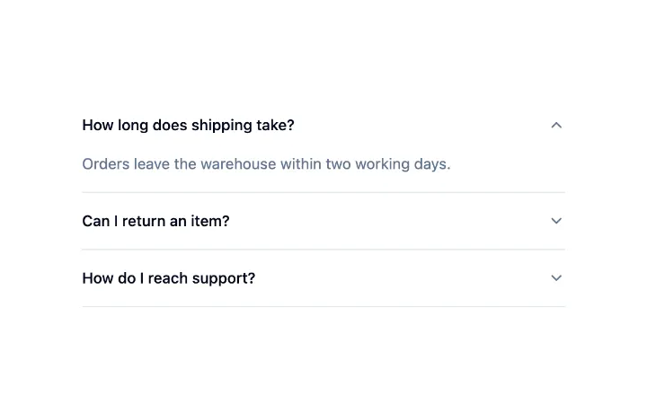
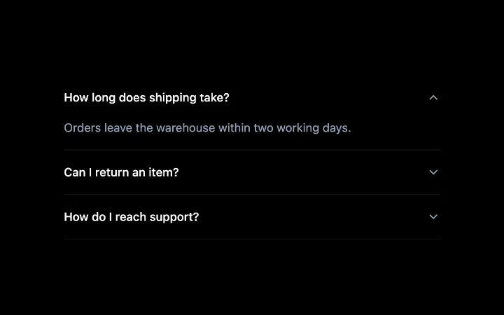
Accordion
A stack of headed sections where one or several open at a time, with a collapse that animates without measuring, arrow-key navigation between headers and labelled regions for assistive tech.

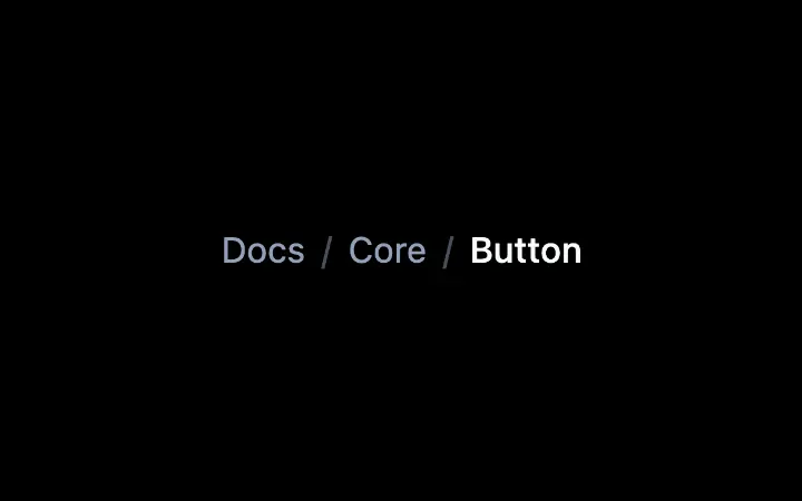
Breadcrumb
A data-driven trail of links with automatic truncation, a decorative separator, and the current page marked for assistive tech.
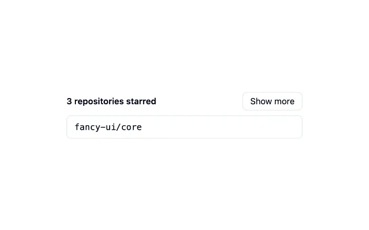
Collapsible
A single disclosure: a trigger that expands and collapses a region, animated without measuring so an interrupted toggle simply reverses, with the closed content kept in the page.