PulseBeam
Breathing border glow that wraps any card: colour blobs drift along the edges as a crisp 1px ring, a feathered inner glow and a blurred bloom, with slow hue rotation, fade in/out on an active flag, four palettes and an outside halo variant
Available for Svelte 5, React, and Vue 3.
Preview
<script lang="ts">
	import { PulseBeam } from "fancy-ui-svelte";
	import ArrowUp from "@lucide/svelte/icons/arrow-up";
	import Bot from "@lucide/svelte/icons/bot";
	import Sparkles from "@lucide/svelte/icons/sparkles";
</script>

<!-- The child owns the surface: opaque background + the same radius as the beam. -->
<PulseBeam radius={20} class="mx-auto w-full max-w-md">
	<div class="bg-card rounded-[20px] p-4">
		<p class="text-muted-foreground text-sm">Build anything…</p>
		<div class="mt-8 flex items-center gap-2">
			<span
				class="bg-muted text-muted-foreground inline-flex items-center gap-1.5 rounded-full px-2.5 py-1 text-xs"
			>
				<Bot class="size-3.5" />
				Agent
			</span>
			<span
				class="bg-muted text-muted-foreground inline-flex items-center gap-1.5 rounded-full px-2.5 py-1 text-xs"
			>
				<Sparkles class="size-3.5" />
				Auto
			</span>
			<span
				class="bg-foreground text-background ml-auto inline-flex size-8 items-center justify-center rounded-full"
			>
				<ArrowUp class="size-4" />
			</span>
		</div>
	</div>
</PulseBeam>
Installation
Usage
<script lang="ts">
	import { PulseBeam } from "fancy-ui-svelte";
	import ArrowUp from "@lucide/svelte/icons/arrow-up";
	import Bot from "@lucide/svelte/icons/bot";
	import Sparkles from "@lucide/svelte/icons/sparkles";
</script>

<!-- The child owns the surface: opaque background + the same radius as the beam. -->
<PulseBeam radius={20} class="mx-auto w-full max-w-md">
	<div class="bg-card rounded-[20px] p-4">
		<p class="text-muted-foreground text-sm">Build anything…</p>
		<div class="mt-8 flex items-center gap-2">
			<span
				class="bg-muted text-muted-foreground inline-flex items-center gap-1.5 rounded-full px-2.5 py-1 text-xs"
			>
				<Bot class="size-3.5" />
				Agent
			</span>
			<span
				class="bg-muted text-muted-foreground inline-flex items-center gap-1.5 rounded-full px-2.5 py-1 text-xs"
			>
				<Sparkles class="size-3.5" />
				Auto
			</span>
			<span
				class="bg-foreground text-background ml-auto inline-flex size-8 items-center justify-center rounded-full"
			>
				<ArrowUp class="size-4" />
			</span>
		</div>
	</div>
</PulseBeam>
Examples
Basic Usage
<script lang="ts">
	import { PulseBeam } from "$lib/fancy-ui/pulse-beam";
	import ArrowUp from "@lucide/svelte/icons/arrow-up";
	import Bot from "@lucide/svelte/icons/bot";
	import Sparkles from "@lucide/svelte/icons/sparkles";
</script>

<!-- The child owns the surface: opaque background + the same radius as the beam. -->
<PulseBeam radius={20} class="mx-auto w-full max-w-md">
	<div class="bg-card rounded-[20px] p-4">
		<p class="text-muted-foreground text-sm">Build anything…</p>
		<div class="mt-8 flex items-center gap-2">
			<span
				class="bg-muted text-muted-foreground inline-flex items-center gap-1.5 rounded-full px-2.5 py-1 text-xs"
			>
				<Bot class="size-3.5" />
				Agent
			</span>
			<span
				class="bg-muted text-muted-foreground inline-flex items-center gap-1.5 rounded-full px-2.5 py-1 text-xs"
			>
				<Sparkles class="size-3.5" />
				Auto
			</span>
			<span
				class="bg-foreground text-background ml-auto inline-flex size-8 items-center justify-center rounded-full"
			>
				<ArrowUp class="size-4" />
			</span>
		</div>
	</div>
</PulseBeam>
Working State
Toggle `active` to fade the glow in and out around a task list.
<script lang="ts">
	import { PulseBeam } from "$lib/fancy-ui/pulse-beam";
	import LoaderCircle from "@lucide/svelte/icons/loader-circle";
	import Check from "@lucide/svelte/icons/check";

	const tasks = [
		"Generate color palettes",
		"Recommend font pairings",
		"Create layout templates",
		"Build section engine",
		"Generate hero variants",
	];

	let working = $state(true);
	let status = $state("fading in…");
</script>

<div class="flex flex-col items-center gap-4">
	<PulseBeam
		active={working}
		radius={20}
		class="w-full max-w-sm"
		onfadein={() => (status = "glow settled")}
		onfadeout={() => (status = "glow off, loop stopped")}
	>
		<div class="bg-card rounded-[20px] p-5">
			<p class="text-muted-foreground text-sm">
				{working ? "Working…" : "Done"}
			</p>
			<ul class="mt-4 space-y-3 text-sm">
				{#each tasks as task (task)}
					<li class="flex items-center gap-3">
						{#if working}
							<LoaderCircle class="text-muted-foreground size-4 animate-spin" />
						{:else}
							<Check class="size-4 text-emerald-500" />
						{/if}
						<span>{task}</span>
					</li>
				{/each}
			</ul>
		</div>
	</PulseBeam>

	<div class="flex items-center gap-3">
		<button
			class="bg-primary text-primary-foreground rounded-md px-3 py-1.5 text-sm"
			onclick={() => (working = !working)}
		>
			{working ? "Finish" : "Start again"}
		</button>
		<span class="text-muted-foreground text-xs">{status}</span>
	</div>
</div>
Outside Variant
Ring plus a blurred halo behind the card.
<script lang="ts">
	import { PulseBeam } from "$lib/fancy-ui/pulse-beam";
</script>

<!--
  `outside` keeps the 1px ring and paints a blurred halo *behind* the content,
  so the child must be opaque — otherwise the halo shows through it.
-->
<div class="py-8">
	<PulseBeam variant="outside" radius={16} class="mx-auto w-full max-w-md">
		<div class="bg-card rounded-2xl border p-5">
			<p class="text-sm font-medium">Deploying preview</p>
			<p class="text-muted-foreground mt-1 text-sm">
				Building 3 of 5 routes — the glow bleeds past the card edge.
			</p>
		</div>
	</PulseBeam>
</div>
Palettes
Colorful, mono, ocean and sunset.
<script lang="ts">
	import { PulseBeam, type PulseBeamPalette } from "$lib/fancy-ui/pulse-beam";

	const palettes: PulseBeamPalette[] = ["colorful", "mono", "ocean", "sunset"];
</script>

<div class="grid w-full max-w-lg grid-cols-2 gap-4">
	{#each palettes as palette (palette)}
		<PulseBeam {palette} radius={14}>
			<div class="bg-card rounded-[14px] p-4">
				<p class="text-sm font-medium capitalize">{palette}</p>
				<p class="text-muted-foreground mt-1 text-xs">
					{palette === "mono" ? "Halved opacity, no hue drift" : "Full palette with hue drift"}
				</p>
			</div>
		</PulseBeam>
	{/each}
</div>
Pill Button
Outside halo on a small control.
<script lang="ts">
	import { PulseBeam } from "$lib/fancy-ui/pulse-beam";
</script>

<!-- Small boxes scale the outside halo down automatically. -->
<div class="py-6">
	<PulseBeam variant="outside" radius={999} class="mx-auto w-fit">
		<button class="bg-card rounded-full border px-5 py-2 text-sm font-medium">Subscribe</button>
	</PulseBeam>
</div>
Interactive Playground
<script lang="ts">
	import { PulseBeam, type PulseBeamProps } from "$lib/fancy-ui/pulse-beam";
	import PropsPlayground from "$lib/components/PropsPlayground.svelte";
</script>

<PropsPlayground
	controls={[
		{
			key: "variant",
			type: "select",
			label: "Type",
			options: [
				{ value: "inner", label: "Pulse inner" },
				{ value: "outside", label: "Pulse outside" },
			],
		},
		{
			key: "palette",
			type: "select",
			label: "Color",
			options: [
				{ value: "colorful", label: "Colorful" },
				{ value: "mono", label: "Mono" },
				{ value: "ocean", label: "Ocean" },
				{ value: "sunset", label: "Sunset" },
			],
		},
		{ key: "strength", type: "range", label: "Strength", min: 0, max: 1, step: 0.05 },
		{ key: "speed", type: "range", label: "Speed", min: 0.25, max: 3, step: 0.25 },
		{ key: "radius", type: "range", label: "Radius", min: 0, max: 40, step: 2 },
		{ key: "active", type: "boolean", label: "Active" },
		{ key: "hueShift", type: "boolean", label: "Hue drift" },
		{
			key: "tone",
			type: "select",
			label: "Tone",
			options: [
				{ value: "dark", label: "Dark surface" },
				{ value: "light", label: "Light surface" },
			],
		},
	]}
	initialValues={{
		variant: "inner",
		palette: "colorful",
		strength: 0.7,
		speed: 1,
		radius: 16,
		active: true,
		hueShift: true,
		tone: "dark",
	}}
>
	{#snippet preview(values)}
		<div class="py-8">
			<PulseBeam {...values as PulseBeamProps} class="mx-auto w-full max-w-md">
				<div class="bg-card p-5" style:border-radius="{values.radius}px">
					<p class="text-muted-foreground text-sm">Build anything…</p>
					<p class="mt-6 text-sm">
						Drag the controls — the loop keeps running, only the look changes.
					</p>
				</div>
			</PulseBeam>
		</div>
	{/snippet}
</PropsPlayground>
Props
| Prop | Type | Default | Description |
|---|---|---|---|
active | boolean | true | Show the glow. Turning it off fades out over 500ms and stops the animation loop; turning it on fades in over 600ms |
variant | "inner" | "outside" | "inner" | inner paints a 1px ring, a 28px feather and a bloom inside the box; outside keeps the ring and adds a blurred halo behind the content |
palette | "colorful" | "mono" | "ocean" | "sunset" | "colorful" | Built-in nine-slot colour set. mono halves the opacities and disables hue drift |
colors | string[] | - | Up to nine CSS colours overriding the palette slots in order |
strength | number | 1 | Overall intensity, 0 to 1 |
radius | number | 16 | Corner radius in px applied to the wrapper and every layer |
speed | number | 1 | Multiplier for the breathing and drift periods |
tone | "dark" | "light" | "dark" | Opacity, brightness and saturation preset for the surface the card sits on |
hueShift | boolean | true | Slowly rotate all hues over a 14 to 16 second cycle |
brightness | number | - | Override the preset brightness filter |
saturation | number | - | Override the preset saturation filter |
onfadein | () => void | - | Called once the fade-in has completed |
onfadeout | () => void | - | Called once the fade-out has completed and the loop has stopped |
ref | HTMLDivElement | null | null | Bindable wrapper element |
class | string | - | Additional classes on the wrapper |
Slots
| Slot | Description |
|---|---|
children | Content the glow wraps; give it an opaque background and the same radius |
Links
Related components
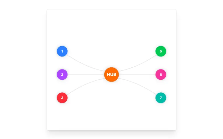
AnimatedBeam
Fibre-optic connector between two elements: a light packet with a dispersing chromatic tail runs along a glass fibre and blooms behind the destination on arrival; theme-aware, seeded and still under reduced motion.
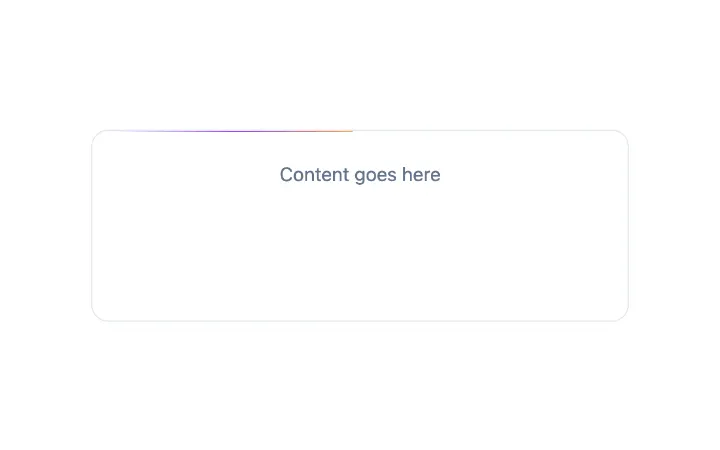
BorderBeam
A single comet of light riding a container's border: a white-hot head, a long feathered tail fading between two colours, a dim hairline that lights up only within the comet's reach, and a soft bloom that sits on the edge.


Confetti
Confetti celebration effect powered by canvas-confetti with button trigger support