 OPEN SOURCE
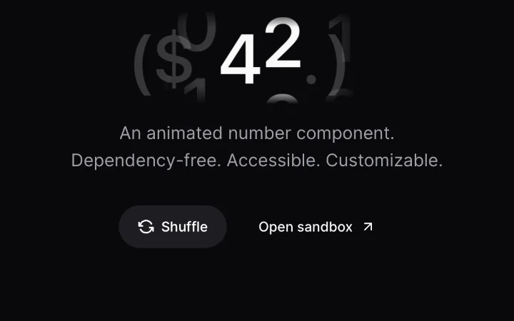
 Number — digit spin
Maxwell Barvian · NumberFlow
RSV Available for React, Svelte, Vue #minimal#press
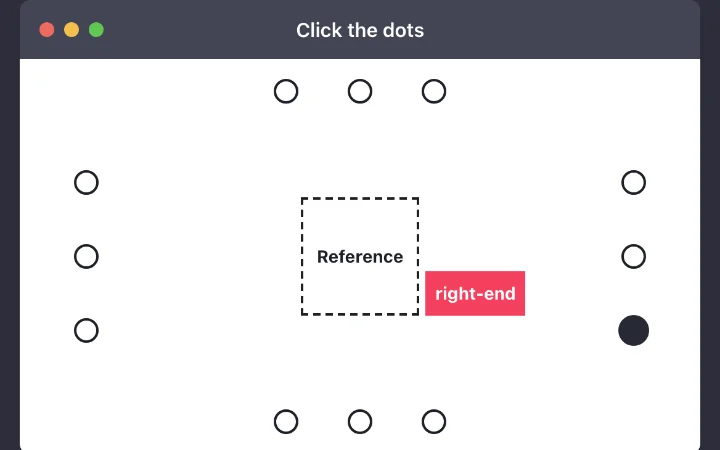
Click a dot around the anchor and the floating label moves to that side and alignment.
An anchored panel you open; the reference teaches placements rather than shipping one.
pnpm add fancy-ui-svelte import { Popover } from "fancy-ui-svelte"; Anchored hint on hover or focus, with a fixed preferred side instead of a picker.
pnpm add fancy-ui-svelte import { Tooltip } from "fancy-ui-svelte"; Twelve dots ring a dashed reference box; each one is a placement, and clicking it moves the floating label there and prints the placement name inside it. The demo teaches a vocabulary (side plus start, centre or end) by letting you point at it. Neighbouring cards show the same anchor shifting and flipping as its container scrolls.
Explaining or configuring anchored UI: tooltip settings, a docs page, a design tool's popover options.
Placement is a preference, not a guarantee: collision handling may flip it, and the label should say what was used. Dots need focus styles and names; colour alone does not mark the selected one.
OPEN SOURCE  FANCYUI
  OPEN SOURCE